COLOUR BLOCKING is the new black or red, or orange or even blue!
Used by designers for years, the latest techniques for colour blocking combine and contrast different aesthetics to achieve stunning results. From uber simple minimalism to complex combinations integrating colour blocks with graphics and typography.
Why use Colour Blocks?
Our senses are ignited through colour! Brands use colour to create a visual reference, often for taste and smell but also as a way to create a visual sense of style. Traditionally the flavours of products have been visually reinforced with blocks of colours that represent the flavour or style of the product enclosed. This creates a number of possibilities. You can reinforce expected colours for traditional responses or challenge and create difference by mixing colour blocks up. There is the possibility you could confuse consumers, but you might also create a delightful surprise or sense of interest.
Colour Choices
The colour choices used in colour blocking designs have evolved in many ways. Designers now create opportunities for brands to choose from blocky bold colours or sophisticated soft colours to achieve the style and branding that fits the individual brand, flavour or campaign. Combining colour blocks with black and/or white creates visual space and lines that elegantly compartmentalise mandatory or product information (that can otherwise clutter the space). You can also do this with gradations of the same colour.
Play with Colour
Some brands are stuck on ‘their colour’, assuming that people only see them and their brand as the colours of their logo or branding colour palette. Creative brands use colour blocking to immerse their logo and branding in new situations. The bolder the exploration depends on the application and also the desired effect but many companies are placing themselves in new situations through creative use of colour. Rather than be restricted to ‘corporate identity’ they are creating new identities and moods that more closely reflect the circumstance, experience or campaign.
How to use Colour Blocking in Labels and Packaging
Labels and packaging are one of the easiest ways to introduce new life to products and printed materials. Start with the black or white version of your logo and team it with colour in other parts of the design. Once you get comfortable you can create monochromatic colour palettes using colour blocks. The bold, brave and creative push this further into graphics, typography, content and imagery that share a sense of synthesis. Have fun with colour & remember sometimes its ok to ‘block’ your creativity.
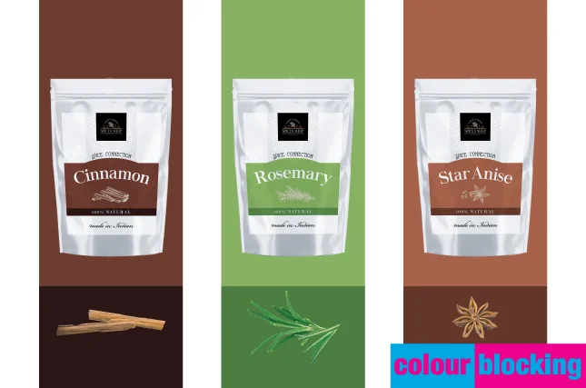 | 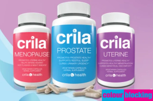 | 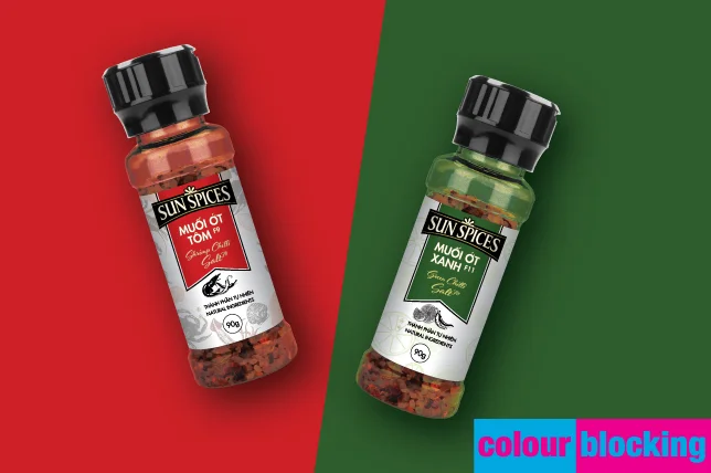 |
IMAGE SOURCES: Images in article GIF are sourced directly from the internet and are examples of the trend noted. They are not owned by QLM nor do they necessarily represent work by the QLM Group.